Showing posts with label ByronM. Show all posts

Sunday, February 17, 2019

'Water Feature' from ByronM: Armoured Jelly Fish Warrior


I was stumped for a theme week entry this time around, not really sure what to do.  I had initially planned doing some more 1/1200 scale Napoleonic ships from Langton that I have kicking around as I need to get them done, but decided against using them as a theme week entry as small figures just do not show as well.  I got digging through my pile-o-shame for something else and happened across what I think is a perfect fit, and something that most people will have not seen before.


The figure is from the Wrath of Kings game of a Hadross Gutter Friar.  He is the leader of a type of warriors for the undersea faction that is made up of various sea creatures with semi-human form.  There are shark-men, fish-men, crab-men, and more.  The model is of a jellyfish-man, which I haven't really seen anywhere else and I find pretty cool looking.


The Gutter Friar is the squad leader and is generally a different colour than the other men in the unit, so I wanted something that would really stand out.  I went with an almost neon green look.  The body was the hardest part to paint ans I did is all with glazes through the airbrush as I wanted a seamless organic look with no paint brush marks to disturb the surface.  I tried several times to get the bubbles done without using inks or washes around them, but in the end had to use them as even my super fine 0.15mm  H&S airbrush could not keep a small enough line to manage it.  Despite having to use washes to define the bubbles, I like how the rest of the green worked with the transitions from black, dark green, neon green, to almost a ivory for the highlights.

The armour was easy by comparison, going from a black through dark blue up to a bright blue.  I wanted to keep the armour black / dark blue but the contrast was so little against the luminous green that I had to punch it up a lot or it just looked black by comparison.


I was stuck a little with the Hadross symbols as well, as I initially tried gold or silver and neither showed well, so instead I went for a bright orange, which makes them pop a lot more against the blue.  Last up was the weapons which I kept a muted bronze that goes to bright gold at the highlights and almost black in the shadows.


While the game Wrath of Kings is not really my cup of tea, I fell in love with a lot of the cool figures they were putting out and got them cheap through their kickstarter.  They have since sat in boxes for years, so I am happy I finally got this guy out and painted, now I want to do more!!!  Maybe some shark-men will see some paint before the challenge is done!

Sunday, February 3, 2019

'Mercenary' from ByronM: Souxsie and Diesel

For this weeks theme round I pulled out a miniature that I have had kicking around for probably 5 or 6 years.  It was picked up because I instantly fell in love with the overall look of it.  It is Siouxsie and Diesel put out by Studio McVey and sculpted by Yannick Hennebo.  I immediately got that old school 40k / Necromunda vibe from it and had to have it.


However, I then saw how fine some of the detail was, and go nervous about painting it.  Over the last 5 years though I have improved a fair bit in my painting and with this theme being Mercenary I remembered her and went digging in my pile-o-shame for her.  I picture her as a mercenary for my Escher Jail Bird gang for Necromunda that I painted in the challenge 2 years ago.


I am happy I waited to paint this figure as I am not sure I could have managed as good an overall look 6 years ago.  We all get better over time.  I still think it needs something for a bit more pop, but could not figure out what that was, so left it for now.

I am not sure about anyone else, but to me the dog looks like Blue (Don Cherry's iconic dog) and therefore just had to be painted white.  It catches a little too much light in the images so looks a bit brighter than it is, it was just hard to balance enough light for the darker figure compared to the light grey / white dog. 


Siouxsie had to have an orange shirt to match the rest of my jail bird figures, and then I went looking for some other brighter colours as she has a very punk look.  The punk look meant the jacket had to be black, as did all the buckles and belts, but I added in some pale blue / turquoise for the jeans and purple for the hair to make sure she still had some colour.


For once I am even happy with how a figures skin and face turned out.  Despite being super tiny and fine I managed to get her eyes and lips painted and put on some purple eye shadow (the wife thinks I am nuts, but that's nothing new). 

The last thing was the base, which actually came with her and is a wonderful sculpt in itself.  I simply did some grey concrete and a bronze manhole cover and I was done.

Oh, and thanks to Curt for finally showing me how to take some decent pictures!  I am far happier with how the colours and shading show up in the photos now.  Previously, I could never capture a good likeness of the figures as they were always washed out.  His method really helps capture a better representation of the figures.  Thanks!


Sunday, January 20, 2019

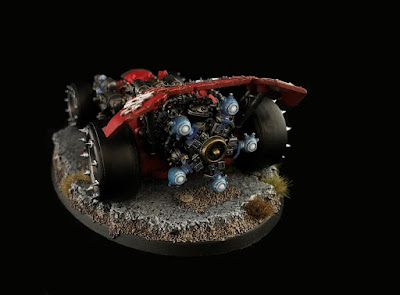
'Sport' from Byron: F1 race car, Ork style...

Games Workshop has a long history with Orks and it has not been good for many years, they have languished without new models for a long while.  However all that was made up for the last few months with several amazing new models, that for me are complete home runs.

There is one though that is a real favourite for me and one I just had to get, despite not even playing Orks!  The vehicle in question is the Shokk Attack Dragsta.


Why it is called a dragster is beyond me as it is an obvious homage to a Formula 1 car, regardless I love F1 and this model just screamed "BUY ME" when it came out, so being a weak willed gamer, I bought one (or two, or three, or ....).


I have visions of painting up a pile of these vehicles in the various F1 liveries to match all the top teams.  I decided to start with one of my favourite drivers Kimi R'Örkönin in his red ones go fasta' Ferrari.

I started by painting the body panels with a deep red and then airbrushed on various layers to lighted it in key areas and give it some high points.  I then went back and edge highlighted with sunny skin tone, which sounds really odd, but someone told me about it as a trick years ago (so I don't remember who or I would give credit) and it works wonders as it doesn't look pink or orange like most edge highlights show up on red.


I kept the engine out of the car to paint it separately as it got in the way of a lot of bodywork and needed some attention of its own.  The engine is a very Orky piece of artwork as it is 3 radial aircraft engines bolted together in sequence with a shokk attack gun bolted on the back to boost power.  It got painted about 3 shades of metal and then several washes to make it grimy and oily.  The shokk attack gun and the gun on the side of the car were both airbrushed to have a blue energy effect.
For anyone unfamiliar with what a shokk attack gun does, it opens a small work hole which Ork's used to feed Gretchen, goblins, and squigs through while opening the other end of the worm hole inside an enemy tank, dreadnought, or even just inside a space marines suit of armour.  It made a mess of things.  However, this one allows the car to "sometimes" jump around the table as it disappears and re-appears through the worm holes it opens.

I purposely left the vehicle very clean and crisp as I want all of the vehicles to look as if they are lined up fresh on the starting line.  I know it is not very Orky, but I just didn't feel right chipping up a shiny new Ferrari.

Last up was to make a base that looked like some old broken up road to race on.  For this I simply used some cork sheet, broke it up, added some sand, and some tufts and was done.

I also had visions of lettering and advertising on the car, BUT I thought I had several more weeks to get decals made for this project! I was busy painting away for the Mercenary theme week when the results were posted from last weeks theme on Sunday only to read that the next theme was Sport!!!  I had not even put the model together at that point, so had to spend Monday assembling and priming, then painting Tuesday and Wednesday, and then pack it up to finish it while visiting Curt this weekend, whom I have to thank for both the hospitality and for taking some amazing pictures for me.  So, back to the decals, I simply did not have time, but will have to later.


Overall it worked out great though, I am very happy with how it turned out, and I am almost done the mercenary entry, so can take some more time on it to get it exactly right rather than being in a rush for the theme weeks all the time.

Thanks for checking it out, and I hope you all like it.


Sunday, January 6, 2019

'Reconnaissance' from Byron: Recce from two Eras

For this first theme week I wanted to finally get a British universal carrier painted that I picked up to paint way back in Challenge #7 and never got around to, however I also had a modern Razr type vehicle kicking around from Spectre miniatures that I picked up to paint last year.  So, my crazy gamer brain decided that I should paint both as kind of a comparison from years gone by to modern.


First up is the universal carrier, which I painted up mainly with the airbrush to get the tones correct and lay down base colours.  I then painted all the details in, added decals and then started with weathering it up.


Even though it is a 28mm vehicle, due to the size I decided to base it to keep it safe from being bumped into things with, and since it is so tiny that it seems like it should be on a base.


The passengers are removable so that it can represent taking soldiers to the front of being just a gun transport. While I generally do not like removable crew, I think the kit would have benefited from the driver being removable in this case as the model could then be used as terrain or an objective piece.


Next up is the modern 4x4 off-road vehicle from Spectre miniatures.  While amazing looking,  this is one hell of a kit to put together though and I do NOT recommend it to anyone that gets frustrated at all with putting small parts together (Greg, do not go anywhere near this one!).  There are a lot of very small parts to this, and mine at least did not come with instructions, so it was a bit frustrating to build, but it is stunning looking (if small) when together.  To be fair to Spectre, the parts are amazing, tons of detail, and I am not sure anything this small and fiddly could be made and be easy to assemble.

I painted this one up very monochromatic as it is meant to go with my desert camo modern elite forces.  There is some colour shifts on it, and lots of layers of dust over everything which kind of mute the look, but it is there when you look closely.


The figures themselves are not removable once put in, and are a pain to even get in in the first place.  I would not want to ride in this thing with 4 people for fun in real life, never mind in a war zone!  They are packed in there tight.  I painted the soldiers in a desert camo pattern that is pretty rough since it was hard to follow a pattern with the many folds in their clothing, I do think they look ok though, especially with their snazzy orange shooting glasses providing contrast.

Normally, things get better over time.  We are used to looking back at old calculators to modern, old computers to modern, old cars to current cars, and almost always the new is better than the old.  There are exceptions to that (mostly with craftsmanship and durability) but most of the time new is better than old.


However, I think this shows one time where old is better than new, at least in my mind.  I don't know about all of you but I would far rather be in a universal carrier anywhere near a war zone than in that Razr.  I mean sure, the UC sides probably don't provide any real safety, but the illusion of something between you and a bullet sure would make me feel safer than literally having NOTHING between me and an incoming round!  I get that the Razr is faster, better handling, quieter, and in many ways better, I just don't fancy getting into in when the bullets start flying, do you???

Sunday, March 4, 2018

'Monstrous' from ByronM: Kingdom Death Dragon King

I had so many things to chose from this round but in the end I decided I had to finally get around to the monster from Kingdom Death that I have wanted to paint since it showed up 2+ years ago but just never felt I could do justice to, the Dragon King.


This thing is HUGE!!!  It is over 9" across, 9" front to back and 8" tall and sits on a 100mm base!  It is an amazing model, even more so for the price I paid in Kickstarter (I think when it was first announced we got it for $30 US?), hell even at retail pricing of $125 US for the Dragon, human version, 4x survivors, and 200+ cards and a book, its not a bad deal!  If GW did this kit it would be $400 and a kidney!


I wanted something dark, but not necessarily black, and not too dark as it would then just blend into the black / grey of the board.  I decided on a purple / blue look, which ended up morphing into more purple as I went along.  I darkened and tried to define all the scale edges, scars, and details with various shades of black, brown, and blue. Then added some highlights to the veins and scars.

In addition to plain washes for each step I also used the Forge World clear airbrush paints to feather in purples, blues, greens and even some reds into areas.  While not super obvious, it does show up in bright light and is visible in at least 2 of the pictures to some degree, especially this one which for some reason just pops with them.
 
 I kept the underbelly a dark purple/blue then washed it with multiple coats of black, blue and purlple until it is almost black, unless you look at it under light then you see the shades through it.

I then shaded the wings to get a fleshy colour as I wanted it to be very different.  I realize you can go with the same skin colour on the wings and it's probably more natural to go so, but I didn't want the overall model too dark so went with this.  I washed in sepia, browns, purples, blues, and greens to give it depth and contrast.
 

The horns are mainly bone coloured, but lightened are darkened to add curvature and contrast to them.  They do have a slight center ridge but are fairly flat, so I wanted to bring that out more with shadow and light.

I had planned to also do the human version of him, which stands at a mere 2" tall, but it is such a gorgeous model in its own right that I did not want to rush it, so he will come later. I have included a picture with the white lion and a survivor to help show how truly monstrous he really is.  Now picture having to fight him with nothing but weapons and armour you have made by killing and carving up lions and antelopes....  Never mind the figures, the game alone fits the monstrous theme.


This last size comparison picture was taken after I put all my lights and photo setup away and realized that I forgot to take it, hence the lower quality picture.  I am really happy with how all the other photos came out for a change though!  You can actually see some of the reflective hues in some of them from the washes and clear paints.

Sunday, February 18, 2018

'Childhood' from ByronM: Alice in Wonderland

For this week's theme week entry I present to you a figure that I have had sitting here waiting for the better part of 4 years.   This figure is a gift for my wife, which is now kind of an annual tradition during the Challenge.   This years addition to her collection is a steam punk version of Alice in Wonderland.  I felt this would fit the childhood theme since it is a favourite story from many a childhood.


The figure is from a company called Guild of Harmony which makes (made?) some excellent steam punk fairy tale figures.  While I can still find a facebook page, the links to any kind of store have disappeared, so I really don't know if they still exist doing this line, or if they are just doing their new line through Demented Games.   It therefore looks like I may need to hunt out other options as I am out of their figures for next year, so any suggestions of other companies out there that do similar figures are welcome!

The figure itself was a lot of fun to paint and I tried to keep it as authentic Alice as I could.  The signature yellow hair, blue dress, and white apron. I then worked on all the small details like the flamingo stock for the gun and the bright green caterpillar, all keeping with the real colours.  I considered going with metal for the flamingo to not have the high contrast clashing colour there, but decided that it would look more the part with it pink.


The white rabbit, I kept partially white, as he is a clockwork rabbit in this case and mainly metal.  So his arms, legs, paws, and face are white, but the rest of his body is silver and brass.

Since the figure is not just a figure for gaming, I wanted to do something a bit more than normal for the base, but wasn't sure what to do until I remembered a pile of scale street lamps that I got a while ago and a pile of small gears.  I came up with the idea of Alice following the white rabbit down a path in a park to their very important date.  The path would be made up of gears to keep the steam punk feel, and the street lamp would be there to help light the way, literally as it lights up with batteries.


Currently the light is lit by a 9v and wires that I cut out of the picture, but it will be lit by watch batteries hidden in the base once I get the bottom part of the base cut, I was so worried about getting the figure done I lost track of time and never cut it in time.  When done the base will be an extra 6mm thick to hide all the electronics in.

I kept the gears a mix of brass, bronze, and copper to fit the theme.  I then added a fall look to the base to keep with the warm metal tones.  I know it contrasts with Alice's cold tones, but I think that works to really make her stand out.


Overall, I am really happy with how everything came out, other than her face!  It is fairly small and I just could not get it just right.  It was either too dark, or too light, and I kept messing up the rose cheeks and eyes.  In the end after about 10 repaints of the face, I gave up with my final attempt which is passable, but still not just "right".  I may do something about it at a future date, but I just didn't have time to keep playing with it and still finish the rest of the figure.  What I was going for was something like Mr. Lee's version of the figures face which is excellent and has tons of character, I just couldn't get it going for some reason this week.  I normally have issues with flesh tones, but this week I was even more befuddled with them than normal.


For those interested this is the fourth Steampunk figure I have done from Guild of Harmony, all as presents to my wife Kim.  The other three were Mary PoppinsTinkerbell and the Little Mermaid.

Sunday, February 4, 2018

'Music/Musician' from ByronM: Ancient Greek Musicians

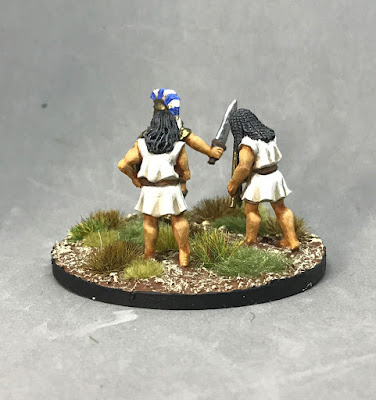
This week was really hard to do something for as I really wanted to stay on track with my projects, but still wanted to enter something.  I had several ideas, but all of them were not related to my current projects, and then the Greek command figures showed up from Steve Saleh from Gorgon Studios and I had an idea.


I needed a command stand for the Athenian detachment for my Greeks and there were a few musicians in the pack of characters, why not have some encouraging a Greek hero.  Well, it almost didn't work, as I ran the idea by my wife, and she said it would be cheating for me to use these figures, as a pipe / recorder / flute (?)  is not a real instrument and I would be stretching the theme and that is not at all what Curt would have meant.  She said I needed to do a band or orchestra or something!  So I pulled up past theme topics and I showed her how some themes get "stretched" and she then agreed that these were fine. 

So, with the bosses blessing it was onto painting time, which was short.  I only started these on Thursday and still had to get my normal Saturday entries up and ready.

These sculpts are great through as they have so much character and charm.  They were also very simple being in robes and having simple instruments, so I spent a bunch of time trying to get the flesh tones right and a rough linen fabric colour right.  I think they are close, but couldn't get them just right. 


The warrior they are playing into battle was much easier despite having way more detail to paint.  since he had less skin showing it was all armour and clothing to deal with.  I used a decal from Little Big Men, but chose not to put a colour under it as I wanted the shield to look like old Greek pottery with black on terracotta, or in this case, bronze.  While understated, I like the look.

While a simplistic take on music, I think it covers the theme enough to get me in, and gives me another command stand for my Greeks.  Two goals accomplished in one thing.

Sunday, January 21, 2018

'BFG' from ByronM: 30K Mechanicum Thanatar Siege-Automata

I had a few possible entries lined up for this week's theme entry for BFG (Big F@$#ing Gun), but in the end decided that I would keep with my ongoing projects and do something that helps progress one of them.

I therefore decided to paint up my 30k Mechanicum Thanatar Siege-Automata.  This thing is a BEAST that towers over everything and has a main gun that is bigger than a Space Marine, so I think that should count as a BFG, right?  The main gun is a Hellex Pattern Plasma Mortar, that is described as being able to arc huge balls of plasma over defensive structures into the enemy lines.  Now, I am not sure how you arc plasma, but OK sounds like a hell of a lot of fun! It then has two huge mauler bolt cannons as it's secondary weapons to help lay down suppression fire if anything is left standing after the mortar hits them.

Not only is the guns on this thing freaking huge, the whole thing is!  To give a sense of size the base is a 120mm x 92mm oval base and a marine barely reaches to his knee! 


This is the model that made me fall in love with the 30k Mechanicum army in the first place, so I wanted to make sure I did it justice when I got to it, so I took my time on this one.


I started it by airbrushing in various layers of browns and working up to reds to get the right shade and pattern to the armour.  I then went back and cleaned up the black under structure of the model with fresh black paint, and then started painting in the metal with gun metal and oily steel.  Once that was done, I washed it down with armour wash and black ink, and then highlighted it again.  I then added some AK engine grime around all the pistons and bolts.  I hope this gives the metal enough depth to look realistic rather than just shiny like metallics tend to come out.


I then went onto the couple of lights and sensors that are on it and painted them as blue gems.  Then the servo skulls and helmet bronze, washed, ad then highlighted copper.
 
 Once that was all done, I put the decals on and then started some weathering.  While I have decided to keep a fairly new look to the armour with no scratches, dents, or rust, I did use weathering powders to dirty up the edges a bit, and really coated the feet and leg plates.  I will be going back to do this on all the other Mechanicum robots that I have done so far to match them up.


Last up was the weapon glow on the mortar and bolter.  While technically not needed on the bolters, I wanted to keep a consistent look across the army so did it anyway.  I think the blue / white gives some good high contrast to help make the figure pop a little more than it would if it was just red and metal.

Overall, I am very happy with how they came out.  Oh, yeah, didn't I mention that I did a matching pair for my entry!  Yeah, in my madness, I decided I needed two of them.... 


I so can not wait to get this force on the battle field.  However, from everything I hear they will suck...  But at least they will look cool doing it!

Sunday, January 7, 2018

'Flight' from ByronM: Dropfleet Commander UCM Beijing Battleship

For the first theme round this year I had a plethora of choices of projects to pick from.  I had several models that I need painted for various games, including a dragon, a phoenix, some planes and helicopters, some jet pack troops, a drop pod, and more.  In the end I did the completely bass-ackwards thing and chose a model that is not even usable in a game...  but one I have wanted to paint since I got it but kept delaying as I was not sure I could do it justice until I had some more practice with my super fine Harder & Steenbeck airbrush.


Well, I've had some practice the last few months with the airbrush so, may I present my take on the Dropfleet Commander UCM Beijing Battleship.  Now, it's not the normal version, this is the kickstarter exclusive all resin 2-up version.  Meaning it is not playable in game, and is bloody huge, measuring a whopping 11"+ long, 5" across, and 4"+ tall!


I wanted to get use a very muted pallet for this model that closely followed the official UCM paint scheme of multiple shaded of grey with some accent white panels.  I started with a black base and then highlighted the top half of the model with a medium grey and the bottom half with a dark almost black grey.  I wanted to keep the bottom substructure almost black but still have visible details.

Once the base colours were setup, I went in with a 0.15mm H&S airbrush and worked each upper hull panel up to a lighter grey in the center, careful to leave the edge of each panel dark.  This took a while as I put the lighter colour on as a glaze of probably 1 part paint 4 parts glaze medium and then thinned down and applied with very low pressure.  I did it this way to ensure that I could not build up to a light colour too quickly, and more importantly so that when I inevitably screwed up and went to close to and edge that it didn't show up to badly unless I did it 3-4 times in the same area.  Once all the panels were highlighted, I masked off the ones to be white and gave them a few coats of flat white.

With the airbrush work all done, I went to the bottom of the hull and used a brush to glaze highlights onto each little bump and part.  I didn't want a chalky drybrush look so had to do it this way which was time consuming but simple.  I then clear coated the model for handling and the next step.


With that done I used thinned down black oil paint to create a pin wash.  I did it this way for two reasons.  Firstly, a thinned oil paint wash wicks through the cracks and details 100x better than any wash I have ever used.  Secondly, Greg showed me a great product that is essentially a hardened q-tip used by Japanese mecha modelers, that you dip into thinner after the wash is done and then wipe it over the model.  It cleans up anything that comes out of the details instantly and completely (assuming you clear coated first).  This has made doing models like this far less stressful than using a normal wash.

After the wash I clear coated again so that the oil paint was sealed away and then went to more detail work.  I added some sparse metal work areas (mainly pipes and pistons) and then painted a few hundred (at least is seems like it) blue lights all over the model.  These were done with a simplified gem pattern of only 4 colours (dark blue, med blue, light blue, white) due to being so damn small.  Of course that hardly shows in the images, so it was not really worth the effort, but oh well.


So there you go, a huge spaceship that is not even usable in a game, all done just for fun.  That said, I bloody LOVE the scale and wished they had done more than just the UCM and a PHR ship in this scale.  Surely it isn't just me that thinks that it would be amazing to do a fleet battle on a gym floor with ships like this!

Oh, and just for comparison, the small ship in the last picture is a normal DFC ship that is 4" long on a 50mm base.


Sunday, March 5, 2017

'Characters/Scene from' ByronM: Steampunk Mary Poppins and Bert (A Gift for my Wife)

For this week's theme week entry I present to you a figure set that I have been waiting to get to and paint all of this years challenge.  That set is Mary Poppins and Bert in steam punk style from the Guild of Harmony, although they call them Maria Poppets and Albert for obvious licensing reasons!  This set is the original limited edition version where they are connected and taking off from the roof tops, which I am very happy to have picked up, as they now only sell them separately.


This figure is a gift for my wife, which is now kind of an annual tradition during the Challenge.  It came up a few years ago that I had never actually painted anything for her (mainly due to the fact that she is not a gamer) over the many years I have been playing games and painting.  So, I decided that in the interest of a happy marriage, I should probably rectify that and went looking for something she would like.  Since she is a huge Disney fan and loves the steampunk aesthetic, I searched out some figures that would relate to that, yet still be interesting to paint.  That is where I happened across the excellent small company Guild of Harmony and picked up several of their figures.


This figure was a bit of a challenge to work on as everything on it is resin and much of it small and thin enough that there is a lot of flex to it (his brush, her umbrella pole, and even his ankle and arm holding her).  Worse, they connect by the hands (well, his wrist) so it adds even more flex if painted together, and even separately there was no great way to hold her for painting.  I painted them separately which was easy enough for him, but had to drill a hole in her, under the dress and stick a metal rod up her dress (much to the amusement of the wife and my teenage boys) to mount her on to paint.


In the past I have just selected colours that I liked, but this time I handed that duty off to Kim as I wanted to make sure it matched her image of them in steampunk style.  So all the credit on the colour choices go to her, I had a different image in my head for colours, but these turned out better than what I had in mind!  Everything started out as a base coat of black and then I did the faces first to get a good expression to go from to stage the figure around, which is not something I normally do, but it helped here.  One thing that I really tried to do was get valid looking skin tones, and added a lot of colour to her, while it doesn't show well in the image, she does have pinkish / rosy cheeks, lipstick and a very pale complexion.  Albert on the other hand has a darker complexion and dirtier cheeks to fit the scene.  I find it really hard to get the flesh or light colours to balance properly against a black background though, so they dont show well.

All of the clothing was worked up from black as well.  I used completely separate methods for each as they are in very different outfits.  For her I glazed everything up using at least 30 thin layers of just one colour on her dress relying on the pre-shading I had done with white primer via airbrush.  It was my first real attempt to relearn proper glazing techniques after having just read Arsies's Painting Toolbox book and having discovered that I need to re-learn many of the things I have been doing wrong (well not wrong, but not in a manner to get better results and learn more over time).  For anyone that did not pick up his book on Kickstarter last year, it is well worth looking for a copy!  I really like the result and think that her dress came out with a really soft look to it and almost no hard edges, it did take a ton of time though.


Anyway, for Albert since his clothing is more work like, I went with a much harder, almost pure wargame/tabletop 3 colour approach.  I ended up using more than 3 colours to get the highs and lows as I wanted them, but as you can see it is a much different look, and I think very close to the style that Curt and Greg use to great effect on many of their figures (which I love, but have a hard time duplicating).

The only part I had any real issues with was the umbrella/helicopter contraption.  I had images of it being colourful and tried several paint schemes (I think I painted it no less than 6 times!) trying to work in purples, pinks, and whites.  In the end, after much "I told you so" from the wife, I went with the copper colour she had suggested to start with.  Damn, I guess once in a while she is right....  shhhh, don't tell her I said that!  Anyway, in the end I think it works better this way as it gives more steampunk look to the figure and helps convey the idea that it is a machine and is in fact strong enough to lift them (even though she shouldn't be able to hold him).


After finishing that off, it was time to connect them and base them.  Here I ran into one other issue, how to base them! I had images of doing a section of roof to put the chimney on, but the supplied chimney was not high enough to build up a V section of a roof peek around as it almost completely disappeared. All the model bricks I have around here are all different in style to the piece so I couldn't extend it with that either. By the time I realized this it was too late to build it up and extend it with green stuff as it wouldn't have time to cure to paint.  I was also not 100% sure that was the look I wanted.  So in the end, I just put a magnet in the chimney and in the base and attached it that way for now, until I figure out what I really want to do with it.

I hope you all like it as much as I do, it was a lot of fun to paint.

For those interested this is the Third Steampunk figure I have done from Guild of Harmony, all as presents for my wife Kim.  The other two were Tinkerbell and the Little Mermaid.