
Curt....you nearly killed me this year with these Bonus rounds titles!!!
There are some right stinkers in there!!
But then I made it even harder for myself, choosing, yes actually choosing to try Greyscale!!
Good grief its hard!
Never again!
Anyway...
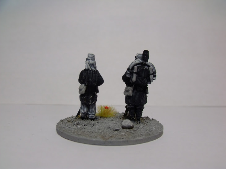
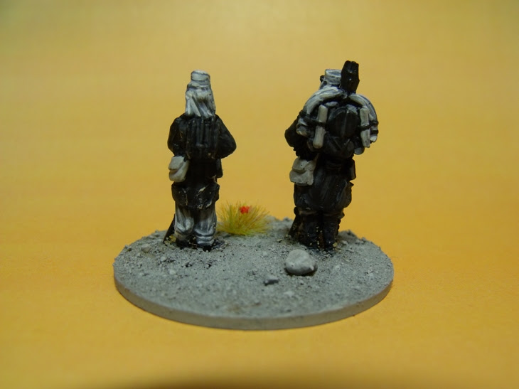
I bought these figures a few months ago as a pressie for my Dad, and
was going to paint them up in colour as per normal, but then had the
(clever!) idea of using them for my Nostalgia entry. As Laurel &
Hardy's films were in Black & White, so should my figures be!
I did email Curt for some tips, which he graciously gave, but as you can see from my paint job, I totally ignored him! groan!!
I'm not happy with how they came out, they're far too dark and look like Zombies!
But its too late to change them now.
I've included two different backgrounds in the photos, I couldn't make my mind up as to
which one looks best? And I added the grass tuft with two red flowers for that simple
splash of colour, a la Curt style.
The figures are from the most excellent Unfeasibly Miniatures, here in the UK.
They make a rather tasty looking French Foreign Legion range, check them out if you fancy something different.

Laurel and Hardy were great and I miss comedy like this. You did a good job on your first effort at greyscale-it ain't easy!
ReplyDeleteNice job Ray!
Thanks Anne, it really isn't easy!!
DeleteGreat choice Ray. Cheers PD
ReplyDeleteThanks Peter!
DeleteYou're a braver man than I am, Ray - They're brilliant!
ReplyDeleteStoopider you mean?
DeleteGreyscale?! You maniac!
ReplyDelete(I prefer the white photo background to the yellow)
I know, I know! Whites good.
DeleteNice idea though on two legends!
ReplyDeleteJust gotta love Stan & Ollie!
DeleteYou mad reckless fool. Bloody good effort though
ReplyDeleteta!
DeleteHeck you did great on this grey-scale thingy Ray!
ReplyDeleteStan and Ollie, Statler and Waldorf, Ray and Fran. The list of comedy duos is seemingly endless. Well done Ray, now stop moaning about the bonus rounds and get on with it. :-)
ReplyDelete+1
Deleteok.....sorry....it won't happen again......
DeleteLike all things practice make perfect. Greyscale is no exception. I bet you will do another at some point, just to improve. A Great gift for your dad.
ReplyDeleteI most probably Won't be getting anymore practice!
DeleteNice work Ray :)
ReplyDeleteGreyscale isn't easy to get right. Well, it's more a case that picking the shades is tough - slapping them on is no different to full colour painting.
Curt was saying its all about cool and warm shades of grey? I thought grey was gray, but that's moi!!!
DeleteCracking job Ray! Really love what you have done with these.
ReplyDeleteThank you Sir M.....not a patch on your masterpiece!
DeleteNicely done Ray! Greyscale is more difficult then it looks.
ReplyDeleteChristopher
Oh yes!!
DeleteYup, greyscale sounds easy but it can be a bit of a b*tch. It requires a subtle touch and I think you did admirably for your first effort. Well done Ray!
ReplyDeleteA bit??? And Me, subtle, I don't think so?? Cheers Curt!
DeleteExcellent choice for the theme and very very well executed!
ReplyDeleteThanks Phil!
DeleteA funny duo like you and a certain Oirishman... :-D
ReplyDeletePerfect choice!
But who's who's??
DeleteWho else if not you could know?
DeleteGrand stuff Ray....
ReplyDeleteBut surely you are used to grey with all your NYW!
Far too much grey, you're right!
DeleteI haven't tried greyscale yet, but yours looks like a good first attempt.
ReplyDeleteJust remember that blue is cold and red is hot. Warmer colors seem closer and colder colors seem to recede. And there is a LEGION of grey, gray, grays or is it greys. I'm partial to the bluish cold ones anyway. ;)
Great job for your first time. I always say I'm going to try new techniques during the challenge, and then usually chicken out. I think the white background works better for the photos.
ReplyDeleteTwo "Grey-t" characters! Very well done, Ray (Or should that be "gRAYt" ?)
ReplyDelete